Thursday, 12 November 2009

Project: Music Inspired Imagery - Illustrators (2)

Gregori Saavedra


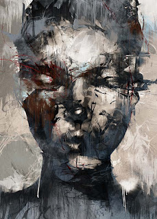
At first glance, you would say Gregori's work is incredibly detailed with a vast array of technical abilities, but once you see how much effort he puts into one single piece it is beyond amazing.

For this single image above he used over a hundred pieces of paper and splattered black paint across each sheet, and that was just for the rain. The model (himself) didn't just have a simple adjustment attached to the whole layer, he went into Image > Adjust > Threshold over and over again across each little bit of his body which eventually took him several hours. The land itself took him over 10 photos in order to get the whole landscape, but apparently that's not too many at all since it usually takes him 50 photos.

I think this piece is meant to convey a sense of fear and frustration with the curled up pose and the black & white scheme really gives impact to the image. With the rain going down on him it almost looks like he's being attacked, by what appears to be his own mind with the way he is clutching his head.

-----------------------------

Anthony Micaleff

Anthony Micaleff... I don't know why his name didn't come up as soon as we were given this task, but he is once again he is an artist who makes me turn into an overly affectionate appreciator of simple things. Normally his work is black & white and rather dramatic with a creepy atmosphere about them, but I instead decided to show one of his coloured works because it's meaning is so true and understandable.

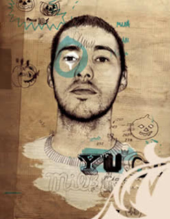
The message inside (literally) of this painting is how our lives are run by corporations. Everything we do has something to do with the product of a company, even the person in this painting is wearing Adidas shoes. Anthony is probably trying to say that we should stop letting these companies take over our identities and just be ourselves. I think the bright colours are also meant to highlight the emphasis on how mainstream these companies are thus involving almost all of us.

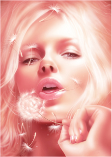
I previously noted that his other paintings are black & white and seem to have a much darker message to them. The whole black & white look gives a much more dramatic impact on the message as well as make the painting noticeably negative. In those types of paintings I also like his frequent use of linen to give a detailed and slightly more interesting look to his portrait paintings. That's the only noticeable technique I managed to find too, the fact he uses oil painting on linen. The rest are obviously paintings with some big splats and dripping paints.

-----------------------------

James Roper

It could be because they're right next to each other, but James Roper's work seems similar to Anthony Micaleff's. I'm not sure why they seem similar, but when comparing the painted areas of this piece to Anthony's coloured work, it seems much more composed and shaped. The combination of colours (sometimes) and swirly shapes fit so well with the drawings and then explode into this huge blast of fun! So there's some normal drawings with composed shapes and patterns for some people, then the explosive and messy style of splattered painting for other people.

I think I got it right about the meaning of this series of illustrations when I was talking about the 'huge blast of fun!'. Because obviously we've got a woman holding her bra apart and would normally be revealing her breasts which are otherwise known as fun, but instead of breasts we are greeted by these marvelous swirling colours sprouting out of their bras. The funny thing is I didn't actually notice this as I was too busy admiring the detail in these colourful shapes.

The way these were made seems obvious. The women were drawn by pencil, and then watercolours were applied to them to fit into the bra, but I think this was either carefully painted on the drawing itself, or they were painted on a separate sheet which was then put into Photoshop and erased away until it matched the drawing.

Wednesday, 11 November 2009

Project: Music Inspired Imagery - Illustrators (1)

Byroglyphics

Byroglyphics is simply an alias of this artist who just so happens to be one of my favorite illustrators of-all-time (Funny how he/she is on the top eh?). Such a style as this ticks some of the top boxes I can think of inside my brain. It's textured, well-detailed, the shades of colour, the erratic yet composed style, melding of various elements, it's all just simply fantastic!

The image above displays all of these things I love (maybe too much) about Byroglyphics. Regardless of the mess you can still quite clearly see a closeup portrait of a woman here, scrabbled up in all sorts of scribbles and wild splatters of paint. If I just saw this image I wouldn't be able to figure out what message or meaning is being conveyed here, but I don't think there is any. I believe that it's a form of self-expression and trying to show a particular feeling through the immense mess which, from what we can see here, seems to be something like confusion, chaotic nature, or fear? I'm not sure, but the look on the woman's face as well as the desaturated and neutral colours makes me think otherwise, giving a contrast to the overall style of the piece.

The way Byroglyphics creates these pieces is all hand-made, another aspect of his/her work that attracts me to these works of art. He/she would start off with a normal drawing of a figure like a person or animal and then do a bunch of scribbles and splatters on some paper, scan them in, and meld the two together so it appears they are one. The main thing about his/her work that you'll now notice is the importance of source materials that play into his/her work. Now, if only I knew what gender he/she was...

-----------------------------

Arno

This style isn't my favorite form of art as I prefer a more textured look, but what I liked about this artist is the soothing nature to his work. It almost makes you just want to reach in and feel the smoothness of his illustrations, but that's physically impossible (for now...) so we'll have to deal with simply using our eyes to appreciate his art.

The image above caught your eye while scrolling down didn't it? (probably because it's the next image down after reading the previous paragraph, but still!) That's because of the use of bright colours and shiny surfaces which also create the very feminine look of the digital painting. The blowing of the dandelion gives a sense of soft motion within the image which helps extenuates the softness and tranquility of this portrait.

I mentioned before about how this is a 'digital' painting. This kind of makes the techniques used for his work self-explanatory, and the fact his only tool is Photoshop makes it pretty easy to realise he uses a graphics tablet to paint his illustrations in Photoshop. There could be thousands of different techniques used here due to the expansive functions of Photoshop, but to name a few he most likely dabbled in the Brushes window and modified some settings, used some adjustments to enhance finished paintings, or possibly a bit of blur which appears to be very likely unless they turn out that way through the process of painting.

-----------------------------

Darren Firth

Aha, another favorite coming right up! The little doodles, various textures, hand-drawn typography as well as the main imagery itself are all aspects of his work I really enjoy admiring. I've pretty much mentioned all the bits and bobs in the image above, but what I think it's all meant to be is a representation of the man being shown. What he's like, what he's into (pumpkins apparently O_o) and just a general overlook of what he could be like as a person.

It's quite obvious that just about everything in his work is hand-made, but if you read about what tools he uses it seems to consist mostly of Adobe programs. I think that's mostly to combine all the hand-made elements made before anything is transferred to the computer though. However, the way the main piece seems to become this one shape could be the product of layer masks being applied to the drawing, erased around the edges and then brushed back in with self-made brushes in Photoshop. The rest seems to be just a collaboration of source materials.

Project: Video Jockey - Genre/Song

Newer day, newer post, newer brief. While my understanding of the term 'Video Jockey' is still unclear, I'd like to think that this project simply tasks us in creating a music video for a song of our choosing. Rather than basing the video on the direct meaning of the song's lyrics though, we are going to base the video on how the instrumentals of the song make us feel and think. So a song without lyrics is ideal.

With all that in mind, I chose
Marilyn Manson - Resident Evil Theme. There are absolutely no lyrics, no specific meaning (that I'm aware of), and only contains instrumental sounds. I'm not too sure on the genre of the song though, but apparently it's 'ambient'. The glockenspiel (I think) combined with the overall creepy vibe of the music is probably the most noticeable thing of the song for me and could be the catalyst for a potential idea. Something like using something that isn't necessarily creepy, but then done in a creepy form. Hopefully these ideas will stem into a stream of many many boxes which contain the product of my mind's doing.

Tuesday, 10 November 2009

Project: Music Inspired Imagery - Lyrics

New day, new post, new brief. The beginning of our new project involves choosing two songs (one out of four songs given to us, and the other being any song we wanted) and analysing the lyrics. I've only managed to narrow my personal song choices down to a few unfortunately (I never knew how many great songs there were out there ><). The first batch of lyrics is one of the four songs that I chose:
Godspeed You Black Emperor - Dead Flag Blues

The car is on fire, and there's no driver at the wheel
And the sewers are all muddied with a thousand lonely suicides
And a dark wind blows

The government is corrupt
And we're on so many drugs
With the radio on and the curtains drawn

We're trapped in the belly of this horrible machine
And the machine is bleeding to death

The sun has fallen down
And the billboards are all leering
and the flags are all dead at the top of their poles

It went like this:

The buildings tumbled in on themselves
Mothers clutching babies
Picked through the rubble
And pulled of their hair

The skyline was beautiful on fire
All twisted metal stretching upwards
Everything washed in a thin orange haze

I said, "Kiss me, you're beautiful -
These are truly the last days"

You grabbed my hand
And we fell into it
Like a daydream
Or a fever

We woke up one morning and fell a little further down
For sure it's the valley of death

I open up my wallet
And it's full of blood


Next up is the song for my personal choice (Translated from Japanese):

Brunch - Imagine

John,
Still in this place people fight only for themselves
John,
Will the paradise you once dreamt ever become real?
The paradise you always dreamt

There isn't up or down
Everyone under the same sky
The paradise from our dreams! (That's our paradise!)

Greedless, nothing to lose
An impartial world
A dream paradise

Here right now!

John,
How's over there?
Has your dream been fulfilled?
How long we need to wait to meet the paradise
We've always dreamt?
The place you always dreamt of!

There isn't up or down
Everyone under the same sky
The paradise from our dreams! (That's our paradise!)

Greedless, nothing to lose
An impartial world
A dream paradise

Imagine all the people in peace!

If I ever could go there
Only with you
The one & only love
Will take me there
Before my remaining life's bells ring
If I ever could go there

There isn't up or down
Everyone under the same sky
The paradise from our dreams! (That's our paradise!)

Greedless, nothing to lose
An impartial world
A dream paradise


There isn't up or down
Everyone under the same sky
Greedless, nothing to lose
An impartial world
A dream paradise

Wednesday, 4 November 2009

Evaluation (Power Animal Project)

An Evaluation

"Hmm?"

Just like the other project, everything about it was based on identity. This time however it was meant to be a direct representation of ourselves in the form of a power animal which we had to then turn into a fully wearable mask. The original intent was to create a stopmotion animation of ourselves doing animal-like movements, but due to the apparently overwhelming amount of annoying paperwork we were stuck with the same goal as the other project, create two still images displaying ourselves which represents our power animals.

The process of deciding which animal represented me the most accurately was rather tough. I didn't want it to be a normal animal you could easily see wherever you went. This way of thinking made certain stages of the creation process rather difficult (like trying to find an octopus in the middle of a park). I finally decided on an octopus because it seemed so random, but as I learnt more about the qualities of an octopus I soon realised this animal matches myself quite well.

An octopus, it's not an animal we normally see, but when we do it's a strange sight. I believe this partly describes me as a person in the sense that I am a strange sight and as you learn more about me, you realise that I'm even stranger than what you assumed which is just like an octopus because of their various weird abilities that are not widely known such as camouflage, wrapping themselves up with their tentacles as a form of protection, and the capabilities to take down a shark. I guess the main thing I wanted to let my audience know is that I'm a strange guy, this is my power animal, he's also strange. There's also a hint of worry and fear in the image below which is portrayed using a dark border around myself that gives off that sense of confinement coming inwards. The radial blur adds some more impact to this as well.

My other image (the one you can see at the top of this post) is actually slightly opposite in the way I portray myself. Rather than being seen as someone with anxieties, I create a stronger image of myself in a more structured manner. I think the colour scheme brings out the strange vibe I wish to convey. Both images also seem to be like it's inside a room, but what type of room is not really being shown here. I'd like to think that rather than a real place, it is actually the inside of my mind.


"Closing in"

Speaking of audience, there wasn't really a specific audience in terms of what type of people I aimed my designs towards. My peers and tutors are obviously part of my initial audience, but then there are future audience members like interviewers for university when they're looking at my portfolio or even a job in the design industry.

The bulk of my experimentation was based on how I should go about melding the different elements of my mask together which included the large head piece, the face mask, the tentacles, and the string to hold it on my head. The tentacles were the tricky part though as I had tried several methods which eventually failed (the tentacles kept falling off ><). Sellotape worked to keep the tentacles in place while I used paper mache to blend in the tentacles with the rest of the mask, but after a 'transportation incident' the mache broke apart from the tentacles and I was left with a VERY noticeable gap. I tried sellotaping them back together which actually worked, but then you could see the sellotape all over the mask so I had to think of another way and that's when the most beautiful material man has ever made arose in my thoughts, double-sided sellotape! I could quite easily stick that on the tentacles, peel off the other side, and stick that BENEATH the mache. This made it appear that the mache and the tentacles never separated in the first place.

The type of paint required some experimenting too because watercolour would just show the newspaper underneath, but then I used acrylic which worked fine. The shade of green was a tough one for me because I'm not very experienced with paints and so I had to try different volumes of green and black to get that dark shade of green I was after. It eventually worked out though, but I wish I had a wider range of paints because the greens that I did have weren't the ones I wanted to use which led to time being used up to create own shade.

There wasn't a huge variety in experimenting on the mask itself since there wasn't really any second chances because once it's been wired and paper mached up, that's it, you can't really go back. So the real experiments were when we had the photoshoot session with our masks and began editing the photos in Photoshop. I tried a few somewhat silly poses in a couple of different areas, but I just wasn't satisfied with any of them except the one where I'm standing straight up. I think that image represents me quite well.

The place with the brick walls was perfect for me because not only would it look good, it also looks like a somewhat secluded place, almost like it's showing you the inside of my mind. The fear, the anxiety, the strange appearance, were all enhanced with digital techniques. But I believe that my mask, the environment I was in, and even myself could be considered materials in which I used to my advantage to convey the message I wanted to send. The somewhat 'shoddy' job I did on the mask made it look odd and not-quite-right, the brick walls created (hopefully) an atmosphere of confinement, and myself acting as a material posed in some particular ways which allowed a clearer message in the idea I am trying to get across.

The wires we used to create the structure of our masks was probably the most accident-prone section of the creation process during the project. We had some experience before from life drawing though with similar wire so we knew what to expect and how immensely annoying they can be to get in the right form.

When thinking about how I spent my time throughout this project, I never really felt like I ever 'managed' it because doing my College work has always come natural to me. I just seem to do it without really considering the amount of time I'm spending on it. In a way, this is probably my strongest asset when it comes to working. I end up doing it all within the time limit and because I enjoy it all so much I don't even see it as 'work' but rather another way to efficiently and enjoyably spend my time (as sad as that sounds).

Soooo much went wrong with the creation of my mask though. The amount of stress I felt when figuring out how to get the shapes I wanted was an utter nightmare! I really wish I could turn back time and add another section beneath the mask where there was a hole the size of my head and I could easily slide the mask on without any complications, but of course I didn't foresee this and getting the mask to stay on my head required me to tie a string through the mask and let the string push into my face to maintain the balance of the mask on my head. Perhaps the poses I did with the final images could have involved some more 'thought' into them too because I'm not very satisfied with them. Next time though I'll make sure I have all the time in the world by doing all my work even faster than I did before so I can spend more of my time on thinking of how I wish to arrange whatever it is we're creating for our future projects.

Evaluation (Alter-ego Project)

An Evaluation

"..."

Our first batch of projects had a theme of 'identity' around them. With Lee, our objective was to create two images which displayed a scene for a particular personality (Emo, Chav, Nerd, Geek) in an almost stereotypical way, and stylize them to correspond with the personality.

I thought about what kind of person I am, and I came up with the personalities of a Geek (not a nerd, there's a difference) and an Organised-Obsessed Guy. My Organised-Obsessed Guy image showed myself dressed up in somewhat smart clothing (Shirt, Tie, Trousers) trying to align a mirror correctly. However, such a simple task of organisation while being so obsessed with alignment, he just can't get it to his standards. This leads to an unbearable amount of agony, but being such a sensible and sheltered type of person, he doesn't show it. I show this through the mirror as a symbolism for his inner feelings.

I think the room itself works well in the sense that with my dark clothing, your eyes go straight to the focal point, me. The whole room is quite a neutral colour too which I think matches the plain, well-kept personality of the guy.

"Agony"

My audience is rather simple . My fellow students, tutors, basically everyone involved within my course. I'd also say any future interviewer for a university or even a job if these designs ever make it into my portfolio.

My experimental phase consisted mostly of trying several different poses and ideas in the photography studio at College. We were in a queue though and the lamps really limited the time you had to take photos unless you didn't mind being boiled alive, so I felt rather rushed and couldn't think clearly. This resulted in photos that 'resembled' my ideas but didn't match my expectations and I just wasn't satisfied with the quality of the photos I took then. The main reason for this was because of the lighting, I didn't like the look of it at all and I felt like I would be able to create a far better image at home in a calmer environment.

At home I managed to find a clear spot and the most experimentation I did there was trying a few varied positions that matched with each other (me and the reflection of me). Moving about my furniture could also be a form of experimenting, in the sense that I rearranged my room a few times over to figure out the best possible spot for my final image. I felt the same way for my geek image, it was so much easier to do it in my own environment without having anyone waiting behind me.

For my geek, I wanted either a closeup shot of my face to show how in-your-face geeks can be with their obsessions regardless of whether you're interested or not OR an angled shot of my body slightly zoomed out laying next to a wall and not even looking at you as a way to show how I don't even notice you because I'm in my own little world of games. I think the one I went with works well though because it uses some rather blatant hints (the headset, wires, and games) as to what type of person I am in these photos. The gradient (purple, which I think helps add to the strangeness of the image) adjustment I added near the end of the design process makes the image, to me anyway, feel old or even vintage. Combine that with the classic space invaders t-shirt I'm wearing you end up with a message that this guy (me) must have been gaming for some time, since the beginning. I also wanted it to be more blatant that these games are his thoughts, so I shaped them accordingly.

I experimented with the materials used for my geek photos because there were so many variations I could use them in. By materials I'm talking about the wires of course. I had to think whether to wrap them around my whole body, or my head, how many wires to use, should I have them criss-cross or flow in one direction, should I allow my face to be seen clearly or unclearly? These types of questions led me to try out several variations until I was satisfied with the results. Such variations involved closer up images, further out images, and slightly different poses.

For the entirety of this project, from the first mind map to the final print, I never had a 'structured' system for how I spent my time working. I would simply have my sketchbook with me at all times, and then fill it in whenever I thought or saw something relative to the project brief. I did everything else whenever I felt like it, which happened to be nearly all the time ^^. This was probably my greatest strength in completing the project. It meant I rarely had a moment where I would feel like "I gotta do this and that and this and that" because I had prioritised "this and that" over everything else because it is what I enjoyed doing the most.

However, my perfectionist attitude (see? SEE!?) brought me some grief in the creation of the geek image as I simply could not satisfy myself with the composition of the image and just kept redoing it, trying different positions, different props, and even different arrangements of the rooms I did it in. Perhaps I should try and do, whatever my perfectionism may get in the way of, in advance instead. One can hope :)

Tuesday, 3 November 2009

Blendation (new word, tell your friends)


"Deery me"

Hey hi hi hello! As part of our power animal project, we were tasked with the objective to combine an animal (one from Wollerton Hall) with ourselves. Unfortunately I couldn't find any octopi during our trip :(, so I decided to choose a deer instead because I managed to get a decent shot of the stuffed deers there. Rather than blend the shape of the deer's head with my own I decided to simply apply the fur to my skin simply because it allows me to maintain two important aspects of myself and the animal, my head, their fur.

I'll be doing a writeup of the design process later since I have to sort out a few other bits and bobs first. See ya soon! :D