Wednesday 30 September 2009

The Birth-Child of Multimedia


Multimedia Birth-Child

This was just a simple, but REALLY enjoyable ^^, exercise in which we utilized all the tools that were taught in todays session. The goal was to meld both of our tutors (Lee & Mark) into one face. So as you can hopefully see, I kept the outer head of Mark as well as his beard and then blended in Lee's face. This is exactly the type of stuff I love doing, which is why I wish I had taken the original photos so I could have a play-about with them at home and perfect a few annoyances in my version of the Multimedia Birth-Child. Anyways, hope ya get a giggle out of it :)
Unit 12, Unit 29 - Ryan King

I had an interesting look through this Computer Arts magazine. I found a few things I quite liked the look of, but there were also a few artists that caught my eye which I thought could be tied in with my current projects.

Ryan King was one of them.


It's quite an old magazine and I couldn't find any other information on him, so whether he is still a student remains to be found out. He generally does abstract photo manipulations by blending together various shapes, colours, and glows to accentuate some sort of atmosphere or vibe.

Even though there are a few details going on in these photos, they are still quite simplistic in nature. But this allows you to make up your own feelings or stories that these photos might convey. He merely pushes you in a particular direction. Generally though, his work seems to have a theme of fantasy about them and these photos feel quite calm and relaxing.

Such techniques can be applied to my own photos in order to emphasize on what atmosphere I wish to convey. So I could also add in a colour scheme to set the mood, and rather than use shapes, I could use textures to help me create a specific atmosphere. By combining these methods I will hopefully be able to create a noticeably stylized photo that can instantly give off the personality of my alter-ego.

Unit 12, Unit 29 - Svpermchine


Sky Wave

This artist (Svpermchine) is actually quite similar to Ryan King, a previous artist I looked into. The main difference though is that his work is a lot more detailed and also comes with just as more detailed backgrounds to help add to the theme of his photo illustrations, but he also has a different style.

I absolutely love the added elements of fire and sparks on the man in the photo "Sky Wave". They really accentuate his movements and give a feel of 'power'. I also like the complimentary colours that add to these 'powerful' movements since, to me, red makes me think of 'danger' which is what this man could be, dangerous because of his power. There is also a sense of elegance to the strokes coming off the man which gives off a whole new feeling of calmness and relaxation.

Probably the main thing I might want to take from this is the emphasis on movement and how it can really add some sort of feeling to whatever it is I may do for my own photos for my alter-egos. Perhaps I could create an overly dramatic effect on myself rushing to an unaligned assortment of objects on a desk to really show how frustrating this personality of mine finds untidiness. Due to the content this could also turn out to be quite comedic which is something I'd LOVE to give a try.

Here are a few more pieces of his work which I believed utilized this feeling of 'movement' and atmosphere:


Unit 12, Unit 29 - He1z


Cobalt Advertisements

He1z is a digital artist who has done numerous, incredibly detailed, adverts for well-known brands such as Nike. I believe the way he works with advertisement works much like what we're trying to achieve with creating a scene for our personalities. With the Cobalt gum adverts he not only shows the product, but shows a very definitive style and feeling to them as you can tell straight away just be looking at them. He appears to do this by using simple colour schemes and relevant objects such as icebergs, plants, or fruits.

This is almost exactly what w
e are trying to do. By using relevant objects and a specific style of photo, we are meant to create a scene that should emphasize the personality of our alter-egos.

This next piece is entitled "Don't Play" which is one of my favorite pieces done by He1z. It is so amazingly detailed
with beautiful illustrations of what appears to be traditional Chinese dragons. The way it glows out from the meditating monkey-head man makes these illustrations appear to be thoughts, visions, or even dreams which I think could be applied to our own photos in some way too.

I'm not too sure how heavily we can edit our photos, but perhaps for my geek persona who obsesses over things like video games, computers, and all that generic stereotypical type of stuff, I could show his thoughts which would most likely be what he obsesses over (obviously). I am simply immersed by how the artist has represented these thoughts though rather than showing them through a mere bubble. It's smooth, the colours are clear but desaturated, everything melds into one being of entity. The whole piece almost appears to have a 'retro' style to it as well.

Here are some of his other pieces just so you can get a taste of his style and how conveys his ideas:


Tuesday 29 September 2009

Mask Ideas


Sketches
(complete with unreadable handwriting :D)

I think I did these small sketches some days ago after looking at a few references. I figured I should jot down a few ideas so that I had a few bits and pieces to build upon when it came to that stage of development for our project. The written sections are just talking about the variable parts of the mask, what sort of 'atmosphere' they convey, some references I used, and general ideas for the mask that I may or may not do.

We should be starting our official, drawn ide
as tomorrow with Mark. So hopefully I can get in some more details, different perspectives, and most importantly, a solid idea of how I want my mask to look while keeping my hands as clean as possible.

BRING ON THE CHARCOAL!!! :D

OH! I almost forgot. The images below are some of the references I used. They all share a common trait in that they have tentacles on their faces, but they each have it done in slightly different ways and styles which I find interesting as it shows there are various ways I could incorporate tentacles into my mask. The Davy Jones one is probably my favorite though simply because it's really stylized and shows a sense of some sort of watery creature from the depths of the ocean. Which is what an Octopus is, essentially.


Mask-Making Techniques

As previously mentioned, my power animal is an octopus. Today we have been told to see how we can make our masks by looking into the different techniques and materials used in mask-making.


This face-mask is one of the simpler type of masks to make. The person who made this could have either created it through paper mache and then, using the same technique, meld the tentacles (which I assume are just tubes) and the mask together. OR used modrock to form up the initial part of the mask and made sure to include holes in which the tubes could be inserted into.


Tribal masks are often made out of wood and then have all the facial features carved into them and sometimes decorated with other materials like fur, wool, pebbles, or even paint.


These are called clay masks and the technique used creating them is similar to how you would use modrock. By applying a soft slab of clay to the face for the basic structure of the face and then slowly molding in all the little details into, kind of like how sculpture works really.


This next mask is a lot more detailed than the previous ones. The mask itself is made from a material called 'foam latex', and the tentacles were made using silicone which could be a useful idea for my own tentacles, but I currently have no idea whether they even sell that kinda stuff without having surgery. The eyes are actually electronics which can be controlled to either light up, or give slight movements.

I'm not too sure on what kind of materials I could use to make sure my tentacles are flexible enough to easily move about, along with a pudgy head if I decide I want to include that part of an octopus. If silicone doesn't work out for whatever reason, I might try other materials like foam, fluff, or even jelly! The attribute I'm looking for is something soft though. I'll see what I can find anyway :)


Friday 25 September 2009

Evelien Lohbeck

Part of our power animal project involves creating a flipbook animation with photos for our power animal. So today, Mark showed us a few animations that displayed some really cool examples of flipbook animations as well as a brief (and hilarious :D) clip of a movie called "The Animation Show". All of this reminded me of a particular artist who I think fits quite well into this category.

Evelien Lohbeck


Aside her interesting hand-drawn website (which I REALLY like by the way), she focuses on animation which can be seen in the "Films" section. I really like how she bends the rules of reality to create these rather short, but interestingly simple, videos.

I'll keep this post short (because
I can't really think of anything else to say right now) and end this with a favorite of mine :)

HP - Invent

Monday 21 September 2009

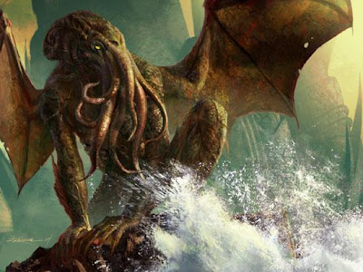
Cthulhu

The myth of the Great Old One, Cthulhu.

"Ph'nglui mglw'nafh Cthulhu R'lyeh wgah'nagl fhtagn"

Another one of our current projects consists of choosing a power animal for ourselves, creating a mask for it, and then produce an animation of us wearing this mask in a relevant environment. I chose the Octopus as my power animal because of a few particular attributes I believe I share with it (I'll get into that in another blog).

This is the research I did on Cthulhu in my sketchbook. The left page is just 'meant' to give off a dark vibe and an element of mystery with the chant of the cultists, but it was more of an experiment than anything else. Trial and error I guess.

The right side shows all the information I researched as well as some purposely hard-to-see images of the creature himself. Since my handwriting is rather messy and unreadable to some, I'll simply type it all down here (with some paraphrasing):

"Cthulhu, the great old one, is considered a creature of significant power with a demonic body, wings of a dragon, and a head that resembles the features of an octopus.

The myth tells us that he is now trapped within the sea, in his city, R'lyeh. With his psychic abilities blocked, he can only communicate to his followers through dreams.

Cthulhu holds a mass amount of worshipers which have formed into a doomsday cult based mainly in Arabia. There are a select few of the cult's leaders in China however who are considered to be immortal. Among other titles, Cthulhu is also considered the "Great Priest" and that he is
"one ofthe Great Old Ones who lived ages before there were any men, and who came to the young world out of the sky".

"Ph'nglui mglw'nafh Cthulhu R'lyeh wgah'nagl fhtagn"
This refers to the chant of his followers which translates into:
"In his house at R'lyeh
dead Cthulhu waits dreaming."
There is also a shortened version which says "Cthulhu fhtagn" which translates into either "Cthulhu dreams" or "Cthulhu waits""


While researching into Cthulhu, I've also noticed that his head makes for a decent example of what I can do when transferring the physical features of an octopus to a mask. I'll go into more detail with that in another blog though.

Sunday 20 September 2009

Quotes

I've always loved quotes. Throughout my life there has always been one or two that I could relate to whether it be about my beliefs, the way I feel, or whatever else that is going on in my mind. They almost act as a form of identity in that sense, which is convenient as 2/3 of our current projects are based around the theme of identity. All though I'd rather just consider that as a nice little coincidence than the basis of why I'm posting this.

This is a small series of posters which hold quotes from famous artists, poets, and scientists done by Shirley-Anne Dick. I LOVE the witty twists they all share and how they all have a relevance to creativity in their own way.

The style looks quite nice too with it's grungy feel and dark shades of colours. I also find how the typography makes your mind read it exactly the way it wants you to read it intriguing. It does this by having the initial part of the quote very bold and instantly noticeable, then have the rest of the quote thinned out and made to be more subtle, only to be read 'after' the main part of the quote to put emphasis on the 'twist' element of the quotes.

You can find the rest by searching for "Creative Truths" (I can't access the original link for some reason :S)


Now as a post based on quotes, we HAVE to have some William Shakespeare! :D

"There is nothing either good or bad, but thinking makes it so"
The whole point of this, to me anyway, is about how our perceptions are what define concepts such as "good and evil" and that we shouldn't just think of everything as black & white and start to use some common sense rather than simply labeling people which is something I can relate with quite a bit. Not everything needs a definition, just an understanding.


Here are a couple of links that could make for a good little read for when you're bored :)
50 Inspirational Quotes on the Art & Science of Design

People Sayings

If you have a few specific quotes you like (not necessarily from this post), leave a comment and let's hear your views on them. Another great thing quotes do is make for interesting conversation :)

Thursday 17 September 2009

Unit 12, Unit 29 - Matt Robinson

I'll probably be making several other posts based around identity (due to the theme of our projects), but I'd like to start off with an artist that came to mind recently who I absolutely LOVE!! (yes, you WILL be seeing more of him)

Matt Robinson

If you want to know more about him (which you must), just check his website since for now I'll only be showing a part of his work entitled "Lad Culture".


For one of our Identity projects, we were told to not only create a new persona for ourselves, but to also create the scene for that persona by using 'atmosphere' and 'relevant messages through objects'. The photo above easily gives off a definitive vibe using these exact elements.

The dark lighting sets the mood to a negative feeling. The old worn-out chair and dirty ground, clothes, and guy all make me feel uncomfortable and intimidated which is what you (or I would at least) feel when confronted with such a person. All of this combined with the beer bottles and the vulgar look of the man really helps show that 'rough' look as well as showing how little he really cares.


Speaking of objects, this photo uses quite a large amount to really expand the possible 'story' behind this scene. Objects like fizzy drinks and his original clothing could tell that this night started off simple, but then we can see empty bottles of beer which might be showing how this night possibly prolonged as well as the reason why he's wearing that... dress (I think?).

Using too many objects might normally hinder the overall scene and detract focus from the person, but in this case the messy, cluttered look blends well with the portrayal of a "contemporary British lad". I also like how they used a bright purple dress to help attract your eye towards him even when he's practically 'submerged' within all this clutter.


Here are the rest of the photos within this series for your viewing... 'pleasure' :P


Friday 11 September 2009

Summer Project


This is the final outcome of my summer project that recently ended. The goal was to create an object that represented ourselves both publicly and secretively. We had to present our work to our class and I felt like I didn't get to say as much as I wanted to so I'll just briefly say those things here :)

Firstly, for those unaware, my idea was to use a puzzle of some sort as my friends considered me an oddity in the way I act. I picked a Rubik's Cube for it's interactivity, being well-known, and for it's structured, organized look which reflects upon how I myself am a structured and organized person. Then to make it more personal, I replaced the stickers with my own digital imagery that represented various aspects of myself.


"T"

It's a T done in a fancy old-English style of writing put across a split, textured background to make it seem more interesting and detailed.

How it represents me:
  • The T obviously stands for my first name (T.H didn't look as good :P).
  • The font is meant to show I like posh, classical things.
  • The grungy background is a style I also like in various forms of art.
  • The font used is actually from an anime, Death Note, which I REALLY enjoyed.


"How may I help you?"

This is a photo of myself in a shirt and tie (I couldn't find a suit ><) laying on a desk. Oh, and I have a light bulb for a head.

How it represents me:
  • The 'look' is to hopefully make you feel like I'm a tidy and professional acting guy.
  • Light bulbs work, they do their job at a flick of a switch. Now replace my head, or rather my mind, with a light bulb. This is to show that I will help you, no questions asked. All you have to do is ask.


"A simple game of Tetris"

The title pretty much says it all. This is nothing more than a simple game of Tetris, except I'm about to die.

How it represents me:
  • I love games. I used to be obsessed with them and play them very often. So much so that I became engulfed by them, as if I was inside them. Which explains why I'm in the middle there.


"AiBC"

This photo shows a piece of paper with the English Alphabet, but there is a slight twist to it. Some of the letters have been jumbled up to form up the abbreviations of the Adobe products. The coloured boxes are just meant to make this more obvious.

How it represents me:
  • I am so obsessed (see a pattern?) with the Adobe products that I will constantly think about what I could do with them which results in seeing their logos in some odd places, like the alphabet.


"Just a few...more...hundred"

Another photo, but this time I'm placing domino after domino across an endless stream of dominoes.

How it represents me:
  • I don't have OCD, but I do have tendencies to show OCD-behaviour by arranging objects in an organized fashion and obsess (you better be seeing that pattern!) over the alignment of those objects. I do have Autism though, which could bring a much deeper meaning to this part.


"Hmmm"

This is where the secretive part of my object comes in. They said we had to include it, but nothing about whether we actually had to show anything. This initially means that even though you know me, it's pretty much guaranteed that you will never know anything 'bad' about me.


I'm still not satisfied with it (especially after everyone else showed their objects O_o) since it wasn't too practical what with each side being images which makes it much harder to solve. I also felt like no one really understood the meanings behind the images (might be due to my shoddy explanations though and the fact not too many could even see the images from where I had to stand).

If anything though, this whole experience was enjoyable which I hope remains consistent throughout my college course :). Anyways, hope ya enjoyed skimming this ;).

Tuesday 8 September 2009

5cm Per Second


Japanese animations are known for their amazing visuals, but one takes it to the next level.

5cm Per Second (directed by Makoto Shinkai) is not only one of the most visually stunning anime movies of all time, but it's also one of the most visually stunning movies all together. I'll be brief with the story and say it's based around the relationship of a young boy and girl and how time and distance slowly pull them apart. Just check IMDB if you want a detailed synopsis :P

Here are a few screenshots that should help illustrate my point as well as show a bit of the story.


This isn't the type of media I would particularly want to do, but it is one of those few things that truly immerses me and gets me thinking about ideas. After watching something so powerful, I just have to figure out a way to pull these thoughts and feelings out from my mind and into a reality, kind of. So if anything, it helps inspire me.

The song at the end is worth a listen too. Even though the Youtube quality doesn't do it justice.